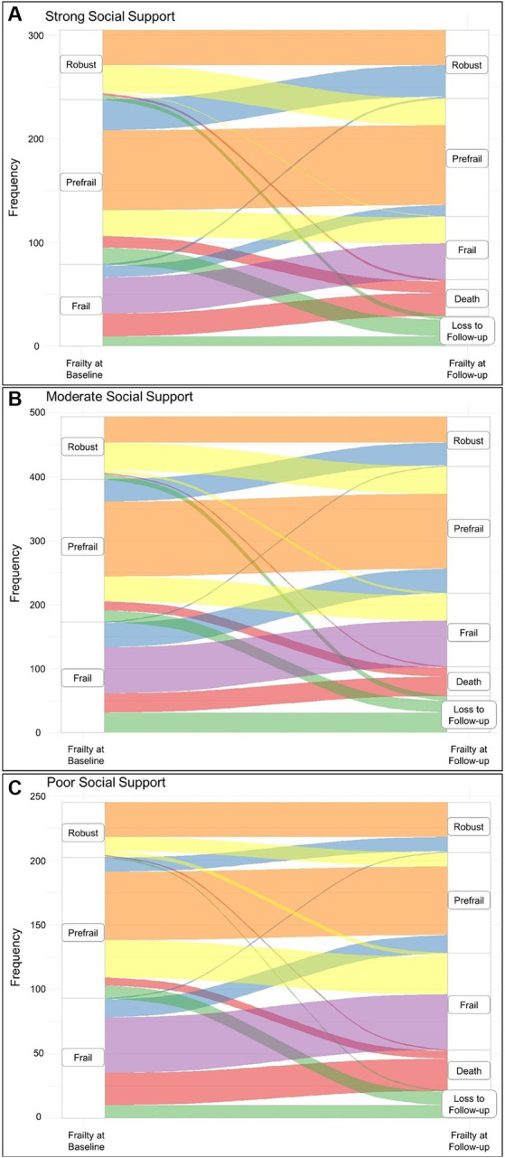
Figure 2.

Sankey diagram showing the frailty transition categories over the observation period stratified by social support categories at baseline. (A) Frailty transitions in participants with strong social support. (B) Frailty transitions in participants with moderate social support. (C) Frailty transitions in participants with poor social support. The color coding refers to the frailty transition categories; orange corresponds to the stable non-frail category, yellow corresponds to the worsening category, blue corresponds to the improvement category, purple corresponds to the stable frail category, red corresponds to the death category, and finally, green corresponds to the lost to follow-up group.
