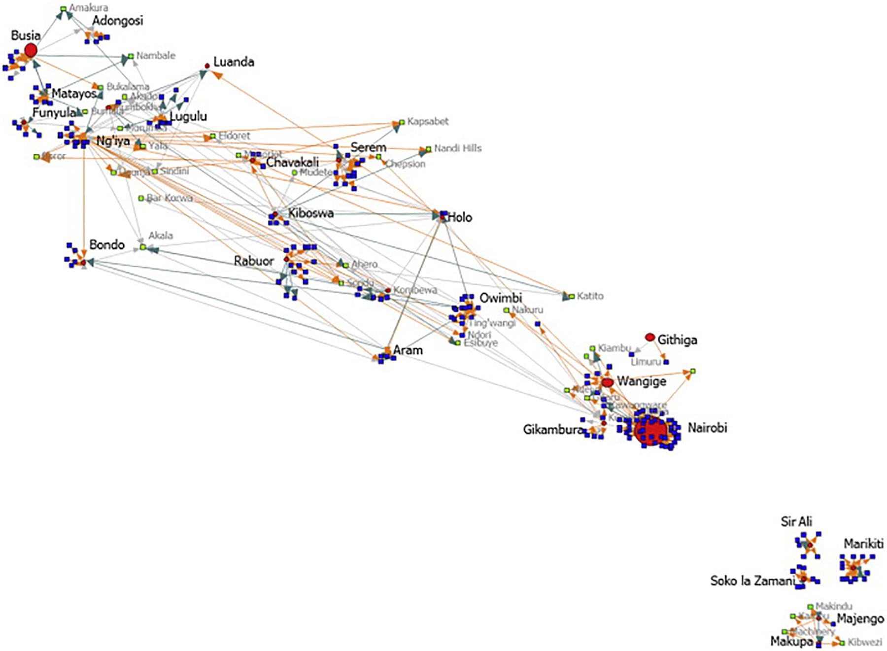
Fig. 2.

Network graphic: major middleman markets, middleman source villages for poultry collections, and trade relationships, Kenya, 2008. The figure is a graphic depicting the trade locations and relationships for middlemen in the poultry trade network. Middleman market trade villages are depicted by red circles of varying size. The size of the circle reflects the total weekly poultry purchases by all middlemen based in that village. Villages where middlemen source their poultry are depicted by blue squares. Villages that serve as connection points between source villages are represented by green squares. These villages are those at which middlemen purchase poultry, and serve as a point connecting middleman trade at two different villages that are not otherwise connected by direct trade on the middleman trade route. The direction of trade by middlemen from village to village is represented by colored arrows. An orange arrow shows middleman travel toward a source village. A turquoise arrow shows travel toward source markets, and a gray arrow shows a two way relationship in trade between a village and a middleman. This graphic is not to scale.
