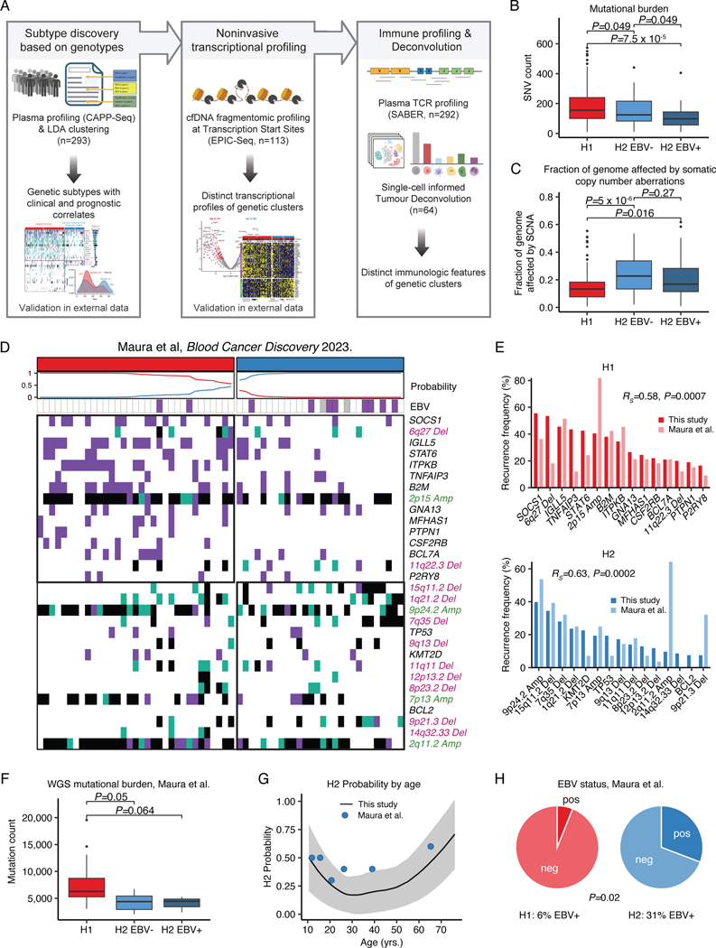
Extended Data Figure 6: Genetic subtypes are independent of EBV status and validate in external data.
(A) Overview figure summarizing genetic cHL subtype discovery and validation. LDA: Latent Dirichlet Allocation; cfDNA: cell-free DNA; TCR: T-cell receptor. (B-C) Boxplots and Wilcoxon p-values (two-sided) summarizing the targeted SNV burden (B), and fraction of the genome affected by SCNAs (C) in cluster H1 (n=200), H2 EBV- (n=56) and H2 EBV+ (n=37) in the plasma sequencing cohort. (D) Heatmap summarizing non-silent mutations and SCNAs (rows) of 61 patients with cHL (columns) as published in Maura et al.20 Clusters were assigned using the probabilistic model generated by LDA from the plasma discovery cohort as shown in Figure 2. (E) Bar plot visualizing recurrence frequencies of features associated with subtype H1 (top) and H2 (bottom) as presented in panel D. Dark colors denote frequencies from plasma genotyping (H1: n=200; H2: n=93, as visualized in Figure 2) while light colors reflect frequencies as described in Maura et al (H1: n=33; H2: n=28). Spearman rhos and p-values (algorithm AS 89) provided in the graphs describe the correlation of recurrence frequencies from all 30 features visualized in D between this study and Maura et al. within H1 and H2, respectively. (F) Boxplots summarizing the whole genome mutational burden in cluster H1 (n=16), H2 EBV- (n=5) and H2 EBV+ (n=3) in patients with available whole genome sequencing and known EBV status from Maura et al. Wilcoxon p-values (two-sided) are provided. (G) Loess regression describing the association of age and the probability of assignment to the H2 subtype in n=292 patients from the plasma genotyping cohort (black line: mean; ribbon: standard deviation*1.96). Each dot represents a group of 10 patients from Maura et al (n=60 total) with x and y illustrating average age, and the fraction of H2 cases within the group, respectively. Patients were sorted by age prior to grouping. (H) Pie chart summarizing EBV status of patients from Maura et al. assigned to the H1 (n=33) and H2 (n=26) clusters. Two-sided Fisher’s exact test p-value is provided.
Panels B,C,F: each box represents the interquartile range (the range between the 25th and 75th percentile) with the median of the data, whiskers indicate the upper and lower value within 1.5 times the IQR.

