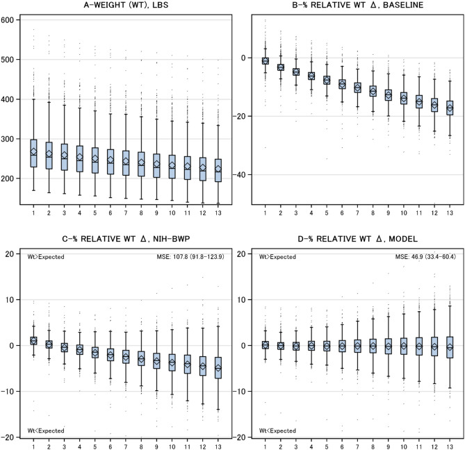
Figure 1.
Weight changes during program. Plots summarize distributions in study cohort of 4 different weight statistics by program week (horizontal axis): A Cohort weight in pounds (LBS); B Percent relative weight difference compared to baseline (calculated as 100*[weight-baseline]/baseline); C Percent relative weight difference compared to NIH-BWP estimate (Eq. 1); D Percent relative weight difference compared to model estimate (Table 2). All plots summarize statistics using Tukey plots in which the box’s middle, lower end, and upper end indicate the median, 25th percentile, and 75th percentile, respectively, and the whiskers extend 1.5 times the interquartile range (i.e. length of box) from each end of the box. The mean and standard deviation is indicated by the diamond in each box plot.

