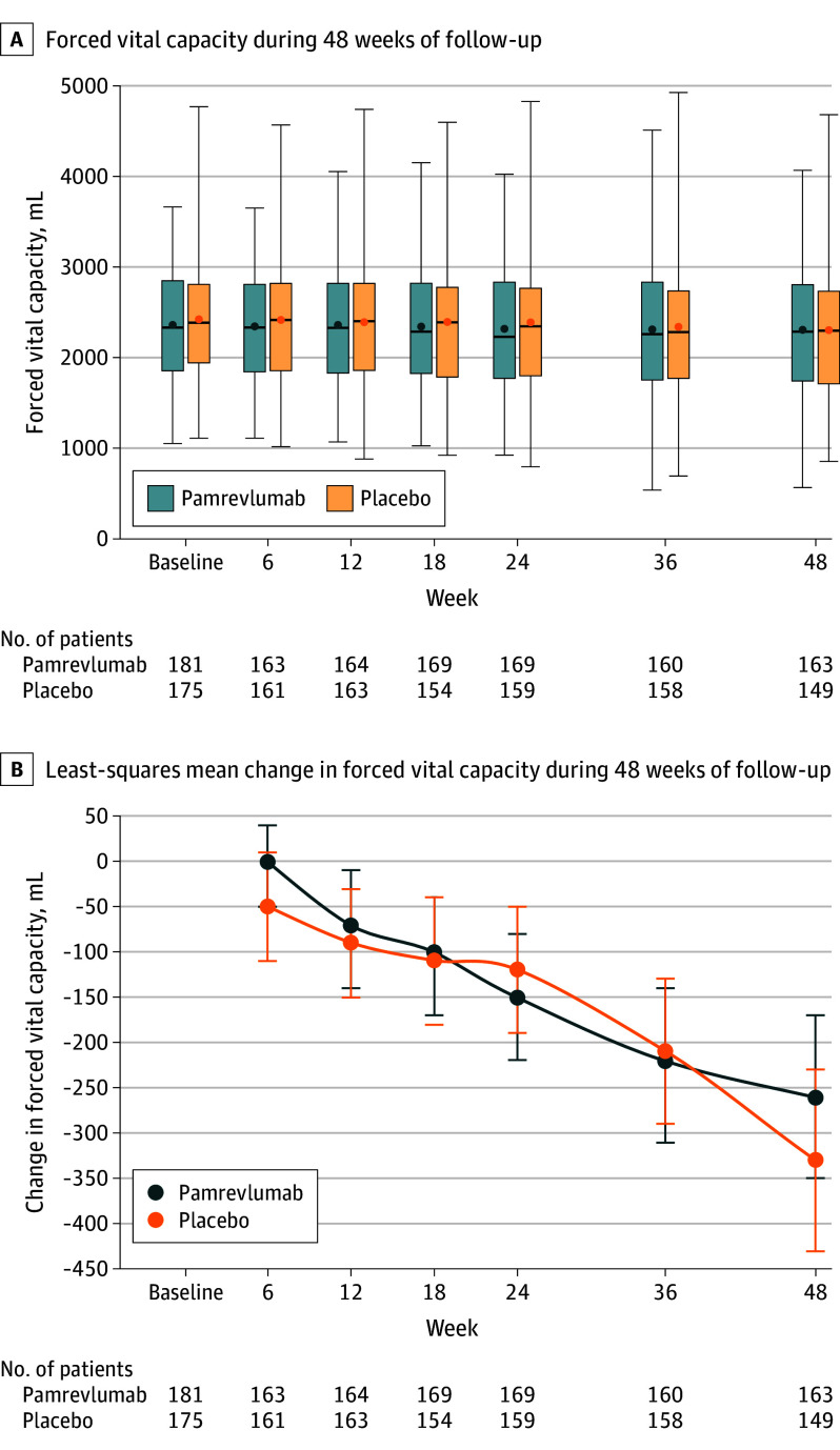
Figure 2. Change in Forced Vital Capacity From Baseline to Week 48 (Primary Outcome).
A, The boxes represent the IQRs, the horizontal lines within the boxes represent the medians, the error bars extending from the boxes indicate the minimum and maximum values, and the dots represent the means. B, The error bars represent the 95% CIs.

