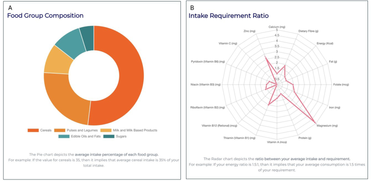
FIGURE 3.
(A) Each segment in the doughnut diagram represents a particular food group and the proportionate allocation of that food group in the optimized THR expressed as percentage of total weight of optimized foods. Details are displayed when the cursor hovers on a section, when using the online ICDS-SNP tool (https://www.datatools.sjri.res.in/SNP/). (B) Radar chart representing the ratio of quantity of different nutrients in the optimized THR to their recommended values, such that the line corresponding to 1 represents the optimized nutrient value meeting the recommended value of nutrient intake in THR giving a ratio of 1. ICDS, Integrated Child Development Services; SNP, Supplementary Nutrition Program; THR, take home ration.

