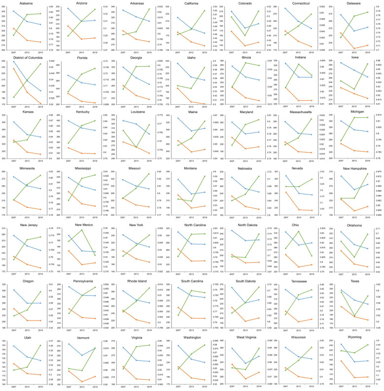
Figure 2.
Data depicts the TBL cancer incidence and mortality (per 100,000 population) among individuals aged over 55 years, alongside the mean NDVI across 49 states in the United States for the years 2007, 2013, and 2019. Temporal trends are depicted by lines on the graph, with blue lines representing cancer incidence, orange lines representing cancer mortality, and green lines indicating the mean NDVI. The horizontal axis (X-axis) spans the three time periods of 2007, 2013, and 2019, while the Y1-axis on the left represents the cancer rate, and the Y2-axis on the right represents the mean NDVI.

