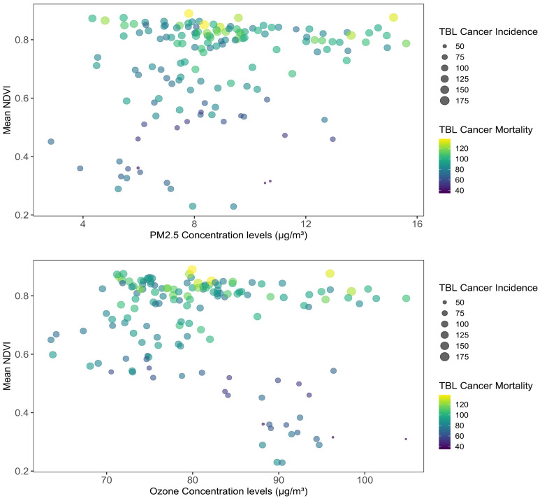
Figure 3.
Mean NDVI and concentrations of PM2.5 and ozone across the states in the years 2007, 2013, 2019. Note: the left panel shows the association of the mean NDVI along the Y-axis and the PM2.5 or Ozone concentration levels on the X-axis. The size and colors of the bubbles measure the TBL cancer incidence and mortality of each state in the three time periods.

