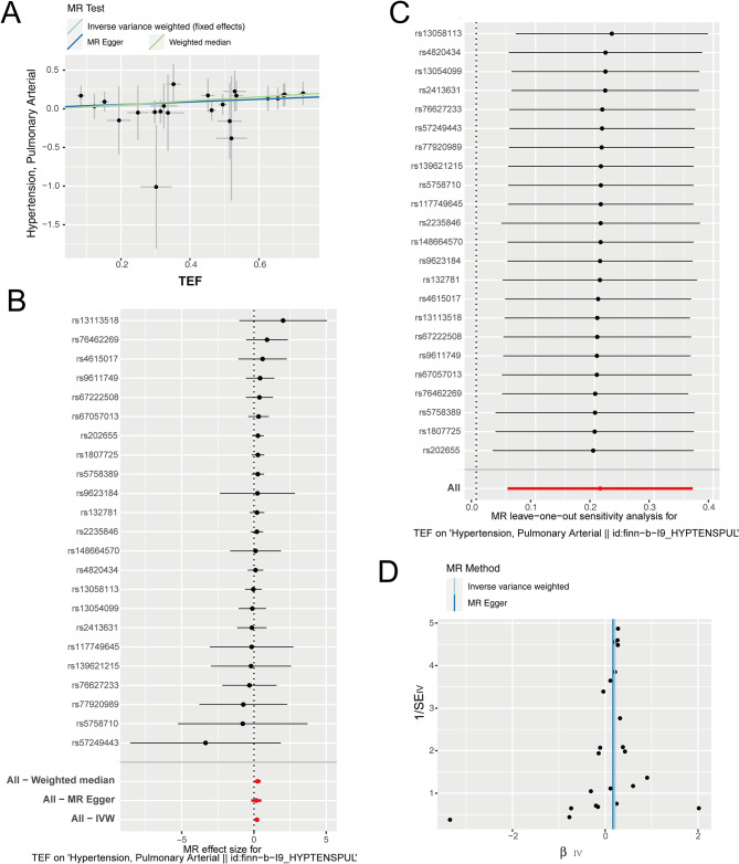
Fig. 3.
The MR analysis results of TEF as the exposure. (A) Scatter plot of MR analysis, showing the distribution of individual rate estimates for PAH as a result of TEF. Each scatter plot includes trend lines derived from three different MR methods, indicating a positive causal relationship. (B) A forest plot depicts the association between PAH and TEF in the MR analysis. Each circle next to a SNP represents the causal estimate for each IV, with the bottom three circles indicating the results from multi-instrument MR analysis using Weighted Median, Egger Regression, and IVW. The horizontal lines represent the 95% confidence intervals for OR. (C) The leave-one-out sensitivity analysis of the SNPs, with each black dot representing an IVW estimate and red dots representing estimates using all IVs. The horizontal lines represent the 95% confidence intervals. (D) Funnel plot for PAH on MR analysis

