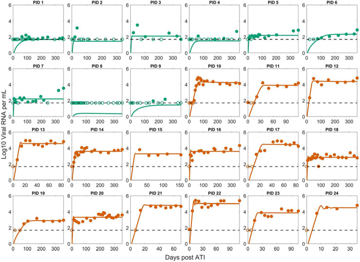
Fig 1. Best fit of Simplified Model 1 to the post-ATI data from Sharaf et al. [57].
Green indicates PTC. Dark orange indicates NC. The horizontal dashed line is the limit of detection. Open circles are data points below the limit of detection (50 viral RNA copies/mL). Filled circles are data points above the limit of detection. Note the x-axis scale varies for the NCs as many of them were put back on ART terminating the data set.

