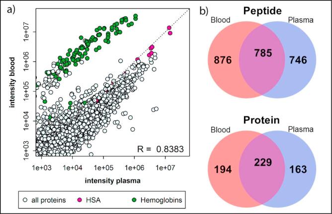
Fig. 4.
The correlation between the average peptide abundance (n = 3) in plasma and dried blood (a). The correlation (R) is calculated based on all transitions, except the transitions from hemoglobins (green circles). Pink circles represent HSA, the highest abundance plasma protein. The Venn diagrams indicate the overlap between the total number of peptides (top) or proteins (bottom) identified in all analytical replicates (n = 3) from blood (red circles) or plasma (blue circles) (b).

