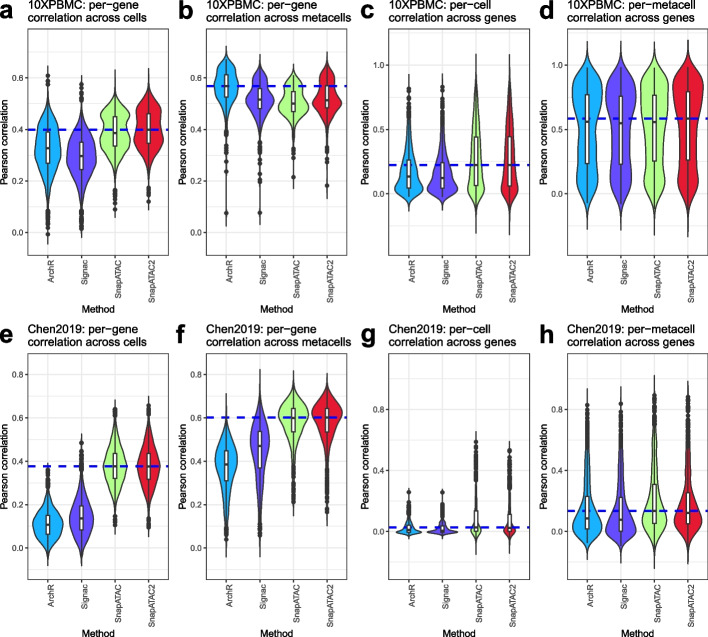
Fig. 6.
Distribution of Pearson’s correlations between the inferred gene activity score and the aligned gene expression. a–d are data from 10XPBMC dataset, and e–h are data from Chen2019 dataset. In a, b, e, and f, the per-gene correlations are calculated across cells (a, e) or metacells (b, f) (500 metacells in total). In c and g, the per-cell correlations are calculated for each gene. In d and h, the per-metacell correlations are calculated for each gene. The blue dashed line represents the median value of the best-performing model. Violin plots represent the smoothed density of the distribution of the data

