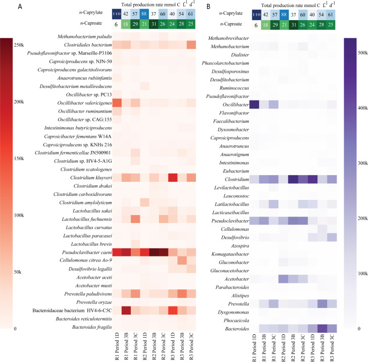
Fig 4.
The most abundant species (A) and genera (B) in the three reactors based on the shotgun metagenome analysis. After normalizing the read count for sample size, the heatmap shows the number of reads aligned to each taxon throughout different sampling points of the reactors. Only taxa with more than 12 k reads aligned are displayed. The names are ordered based on the NCBI taxonomy. The top of the plot shows the n-caprylate (blue) and n-caproate (green) volumetric production rates for Periods 1D, 3B, and 3C, respectively; color intensity is proportional to the production rates. R1–3 are Reactors 1–3.

