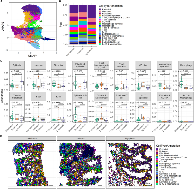
Figure 4.
Changed cellular composition of the tissue during dysplasia development
(A) UMAP displaying all identified cells clustered into cell subsets using Rphenograph.
(B) Bar graph showing cellular proportions of each cell type cluster.
(C) Boxplots showing proportions of cell types per tissue biopsy analyzed in the annotated disease states. Each dot represents the result of individual biopsies. ANOVA statistical test was performed, with Tukey HSD post-test. p values were adjusted for multiple comparisons with Bonferroni and indicated in the graphs.
(D) Representative images displaying localization of cells, colored by cluster. See also Figure S4.

