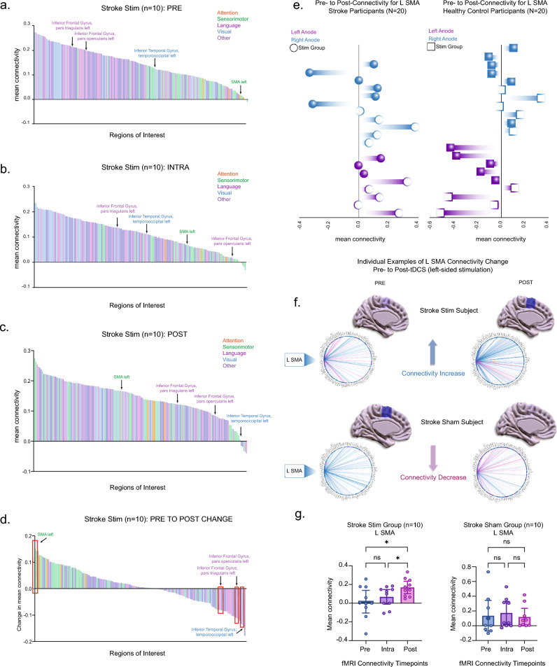
Figure 2.
(a–d) Averaged connectivity for 164 brain atlas regions in the stroke stim group (n = 10) are arranged in descending order. Each bar represents one region of the atlas (error bars removed for clarity). Each region is color-coded to the following functions: attention (orange), sensorimotor (green), language (magenta), visual (blue), and other (purple). These depict averaged values at the (a) pre-stimulation, (b) intra-stimulation, and (c) post-stimulation timepoints. (d) The difference in mean connectivity from pre- to post-stimulation for the stroke stim group (n = 10) is illustrated, with L SMA displaying the highest positive change in connectivity. Red boxes indicate four areas with statistically significant change with stimulation. (e) Subjects with a right-sided anode are represented in blue, while those with left-sided anode are shown in purple. The left column corresponds to the stroke group (N = 20) and the right column to the healthy control group (N = 20). Filled-in shapes denote subjects in the sham group. The x-axis displays the mean connectivity for the L SMA, ranging from positive to negative values. (f) Sagittal brain slices and connectomes illustrate L SMA connectivity changes from pre- to post-stimulation in two individual subjects. The top example represents a subject from the stroke stim group, while the bottom depicts a subject from the stroke sham group. Darker blue signifies higher connectivity, while a more translucent blue indicates lower connectivity. (g) The mean connectivity of the L SMA to all other 163 regions of interest were computed and compared between the pre-, intra-, and post-stimulation phases (see Supplementary Table 2 for all 4 areas with significant changes).

