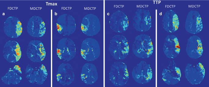
Fig. 2.
Examples of corresponding hypoperfusion patterns on time to maximum (Tmax) (a, b) and time to peak (TTP) maps (c, d) obtained from flat-panel detector computed tomography perfusion (FDCTP) and multidetector computed tomography perfusion (MDCTP). Each column represents three exemplary axial images of the corresponding hypoperfused tissue. Jet color coding from blue to red was used, with red colors indicating delayed perfusion compared to non-hypoperfused areas coded in dark blue. Comparable extensions can be found on FDCTP and MDCTP Tmax maps for the left M1 occlusion (a) and the right M2 occlusion (b), as well as on TTP maps from FDCTP and MDCTP for the two examples of left M1 occlusion (c, d)

