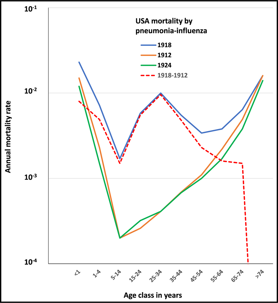
Figure 3. Annual mortality rates (log scale) as a function of age observed in the 1918 influenza pandemic following a W-shaped curve (blue).
Figure also displays the mortality rates for seasonal influenza pneumonia 6 years before (1912, orange) and after (1924, green) the 1918 pandemic and excess of mortality for the year of the pandemic (1918) compared with the seasonal flu in 1912 (dotted red line). The data are for the USA and were obtained from Linder and Grove.20 Raw data for Figure 3 are in supplemental Table 3 (data availability).

