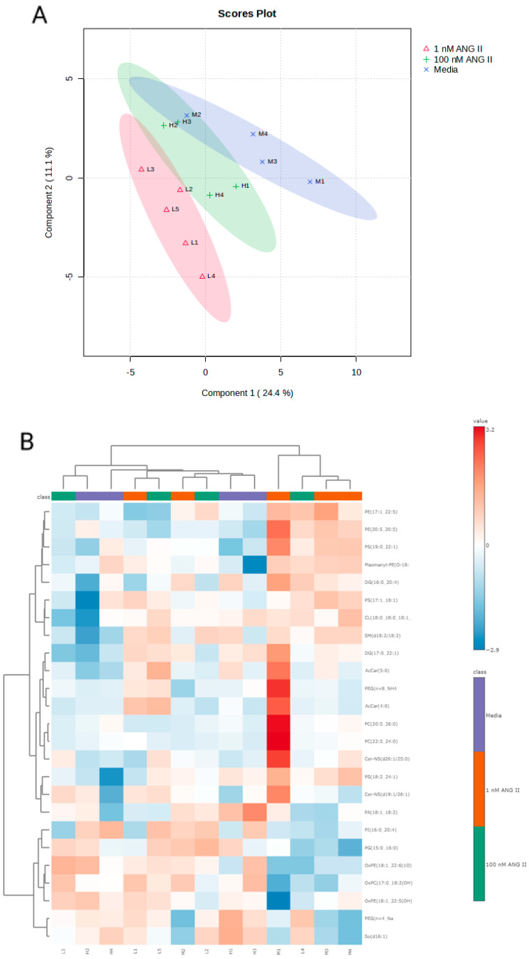
Figure 6.
(A-Top graph) Principal component analysis scores plot for rat colonocyte lipids with each point representing the lipids in a single sample, the ellipses representing the 95% confidence interval, and the colored groups representing the three different treatments (blue = control, red = low Ang II, and green = high Ang II). (B-bottom graph) Heatmap showing significant changes in the levels of lipids following exposure to Ang II. Data were subjected to ANOVA followed by Fisher’s least significant difference method (Fisher’s LSD), and significant changes were set at p < 0.05.

