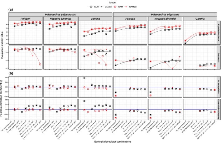
FIGURE 3.

(a) Top facets correspond to the amount of variation (percentage) explained by different ecological predictor sets with different specifications during model calibration. The bottom facets indicate the consistency between observed and predicted abundances via Pearson's correlation coefficient (r). Models with r < .7 were excluded from the analysis. Black and red lines correspond to loess smoother fits for Generalized Linear Models (GLM) and Generalized Additive Models (GAM), respectively. Solid lines correspond to models that used all uncorrelated predictors in each predictor set (“GLM” and “GAM”), whereas dashed lines correspond to models that used uncorrelated and significant selected predictors that were fitted into each model (“GLMsel” and “GAMsel”). (b) Correlation coefficients between optimal abundance and suitability models that had significant correlations (p < .05). Top facets correspond to abundance projections via the “no extrapolation method”, whereas bottom facets correspond to projections via the “extrapolation and clamping” method. The blue line represents the non‐correlation value (0), above and below which correlations between suitability and abundance were significantly positive and negative, respectively. Sets of predictors (x‐axis) are ordered by increasing complexity regarding the number of predictor variants from left to right, accounting for individual predictor types (models S1–S7) and a gradual combination of different predictor types (models S8–S13). The set of predictors in models S1, S3, S4, and S6 were not included in the analysis since no distributional models achieved minimally optimal evaluation parameters (AUC > 0.7 and TSS > 0.4).
