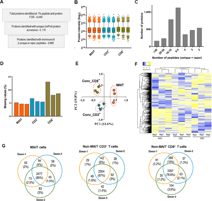
Fig. 2.
An overview of the proteomic dataset obtained from MAIT and conventional/non-MAIT T cells. A. Number of proteins obtained at various stages of data curation B. Distribution of normalized protein intensities across different samples (central lines and boxes represent means and 95 % confidence intervals respectively while whiskers are 2.5 to 97.5 percentiles) C. Number of proteins identified and quantified with varying number of peptides D. Percentage of proteins with missing values in each cell population (percentage was obtained from the total number of identified proteins) E. Principal component analysis of protein intensity data F. Heat map showing the hierarchical clustering of quantified protein intensity data. G. Venn diagrams ilustrating the variations in protein expression across three donors for all cell populations. Within each T cell group, these diagrams visualize both common and differential proteins across the donors.

