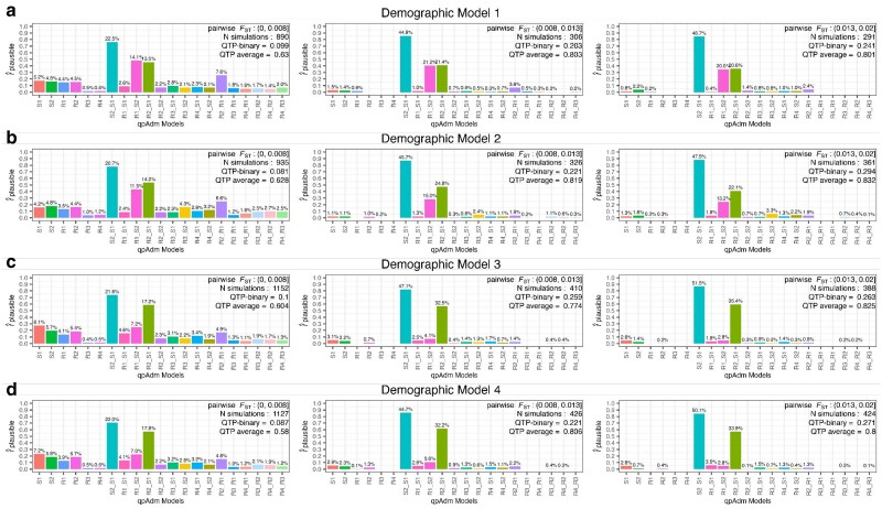
Fig. 5.
Distribution of plausible single-source and two-source qpAdm models across three population differentiation ranges (between the S1, S2, R1, R2, and R3 populations) and across the four simple demographic models. The number of generations since admixture is less than or equal to 100 in all cases. Each row a–d) represents one simulated demographic history, and the columns are increasing ranges of population differentiation (FST) corresponding to the historical period demarcations indicated in Fig. 1b. The values above each barplot represent the proportion each qpAdm model is plausible among all plausible qpAdm models within the simulation iterations for each differentiation range. The y-axis shows the frequency of each model as plausible across the total number of simulations within each differentiation range. In the top right corner of each barplot is the FST range, number of simulations within that range, and the average QTP and QTP-binary.

