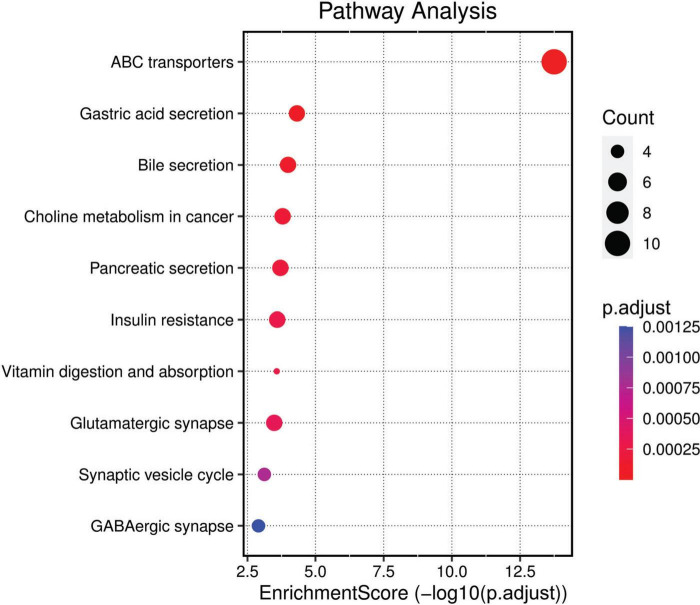
FIGURE 4.
KEGG Pathway Analysis. This bubble plot visualizes the enriched pathways among the differently methylated genes based on the Kyoto Encyclopaedia of Genes and Genomes (KEGG) database. Pathways are listed on the y-axis and are ordered by the enrichment score (−log10(p.adjust)), plotted on the x-axis. The size of each bubble corresponds to the gene count within the pathway, and the color gradient represents the adjusted p-value, with darker hues indicating higher significance.

