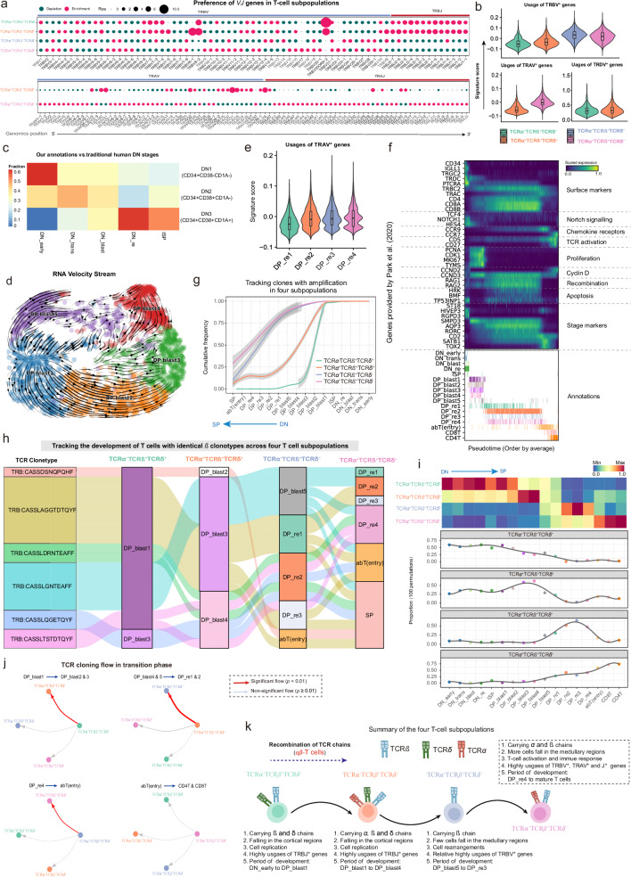
Fig. 8. Characterizing the temporal sequence of differentiation dynamics in four T-cell subpopulations.
a Bubble plots showing the preference of each TRB[VJ]* gene segment present in the four T-cell subpopulations (top) and TRA[VJ]* in the TCRα+TCRβ+TCRδ+ and TCRα+TCRβ+TCRδ- subpopulations (bottom). Gene segments are positioned according to their genomic location. b Violin plots showing the distribution of signature scores across the four T-cell subpopulations, as inferred by TCRα, TCRβ, and TCRγ V gene segments. Median value, interquartile range (IQR) as bounds of the box and whiskers that extends from the box to upper/lower quartile ± IQR × 1.5. Subpopulations: TCRα-TCRβ+TCRδ+ (n = 4165 cells), TCRα+TCRβ+TCRδ+ (n = 3305 cells), TCRα-TCRβ+TCRδ- (n = 12,691 cells), and TCRα+TCRβ+TCRδ- (n = 39,015 cells). c Heatmap showing the association between the DN subsets defined by our clustering strategy and the traditional human DN stages. The color gradient reflects the relative proportions of our annotated DN subsets across the DN1-DN3 developmental stages. d RNA velocity stream from DP_blast1 to DP_blast5, with cell subsets marked with color codes. e Violin plot showing the distribution of signature scores across DP_re1 to DP_re4, as inferred by TCRα V gene segments. Median value, interquartile range (IQR) as bounds of the box and whiskers that extends from the box to upper/lower quartile ± IQR × 1.5. Cell subsets: DP_re1 (n = 3865), DP_re2 (n = 18,337), DP_re3 (n = 2152), and DP_re4 (n = 3010). f Heatmap showing representative genes provided by Park et al.8 across T cell differentiation pseudotime. Top panel: The x-axis represents pseudo-temporal ordering. Gene expression levels across the pseudotime axis are maximum-normalized and smoothened, and grouped by their functional categories and expression patterns. Bottom panel: Cell type annotation of cells are aligned along the pseudotime axis. g Tracking of T cells with identical TCRβ chains in the four T-cell subpopulations from DN_early to SP (single positive) development. Cumulative distribution curves showing the number of T cells at different stages (see “Methods”). Lines smoothed using generalized additive models (GAM), with shaded areas representing 95% confidence intervals. h Sankey plot tracking the differentiation routes for cells sharing identical TCRβ clonotypes across T-cell subpopulations. i Heatmap (top) and line plot (bottom) showing the relative abundance of the four T-cell subpopulations at each stage from DN_early to SP development. Abundance was averaged for each cell type after 100 down-samplings for the four T-cell subpopulations respectively. j Significance of the transition of each T-cell subpopulation to the other three subpopulations at specific differentiation stages. P-values obtained by one-sided hypergeometric tests, with p ≤ 0.01 indicating a significant transition to a specific subpopulation (see “Methods”). k Schematic diagram of the developmental timing of the four T-cell subpopulations. The solid line indicates a transitional relationship between two subpopulations and the dotted line indicates the absence of such a relationship. The thickness of the solid line represents the strength of significance obtained in Fig. 8j. DN: Double negative, DP: Double positive, SP: Single positive, DP_blast: DP blast cells, DP_re: DP rearrangement cells, TCR: T-cell receptor. The TCR icons in Fig. 8k were created with BioRender.com and released under a Creative Commons Attribution-NonCommercial-NoDerivs 4.0 International license. Source data are provided as a Source Data file.

