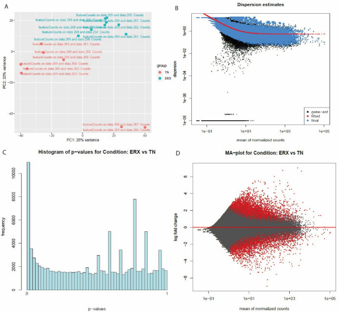
Figure 2.
The PC plot (A), Dispersion estimates (B), histogram (C) and MA plot (D) were created by DESeq2 tool of E-GEOD-45419 dataset. (A) PC plot shows two phenotypes: ER+ and TN. They are grouped on the basis of expression. (B) Dispersion estimates quantify the level of variability in gene expression across samples. Blue dots represent low dispersion estimates of genes and it shows the gene expression is relatively stable while the black dots represent high dispersion estimates. The red line shows the mean or median dispersion estimates. The blue dot close to red line indicated stable expression and the black dots close to red line suggests that the expression values are more variable. (C) Histogram shows the DEG’s grouped into bins or the frequency of genes. (D) MA plot the differences between measurements based on ER+ and TN by transforming the data by using log ratio and mean average. The red color shows the dispersion of differentially expressed genes while grey color shows no variation.

