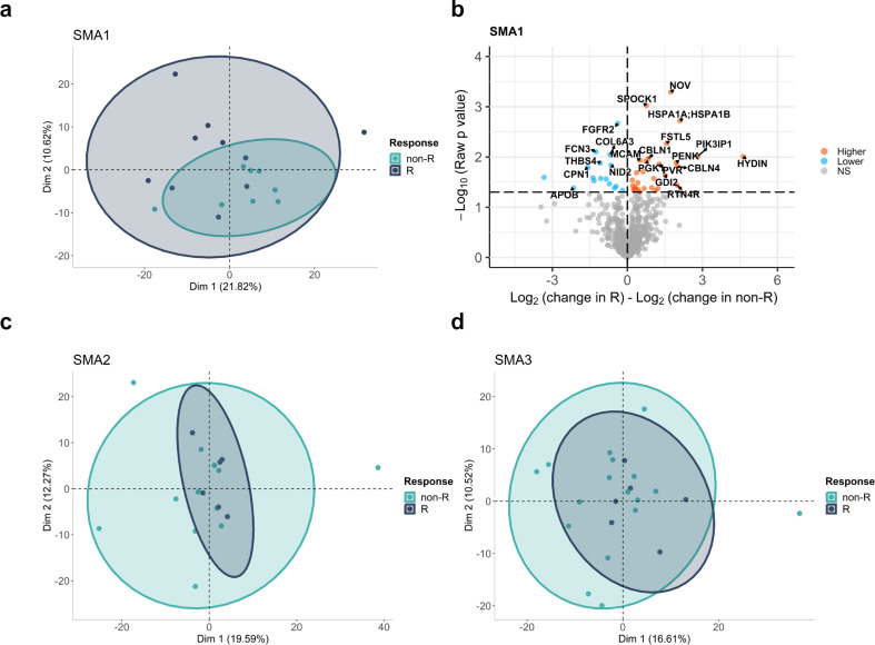
Fig. 5.
Responders vs. non-Responders analysis. The clustering patterns of the responders (green) and non-responders (dark grey) based on changes in protein levels after nusinersen treatment were shown by PCA plots based on first two dimensions for (a) SMA1, (c) SMA2, and (d) SMA3. Each dot represents one sample, and ellipses correspond to 95% confidence intervals for each of the subtypes. (b) Volcano plot for comparison of time-wise changes in protein levels in each responder and non-responder samples. Fold change differences were calculated by subtracting log2 fold change of proteins between T302 and T0 in non-responders from log2 fold change between T302 and T0 in responders, and higher and lower changes in responders compared to non-responders were shown by orange and blue colors, respectively

