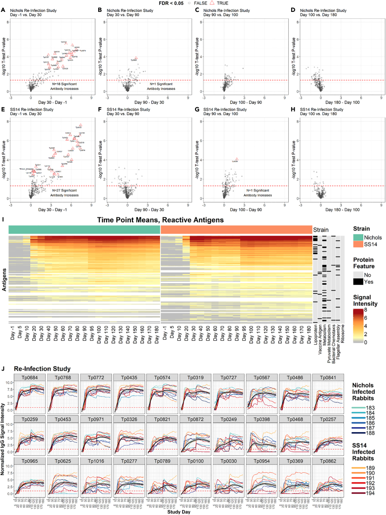
Figure 6.
IgG reactivity profiles of rabbits that were infected, treated, and then reinfected
(A–H) Volcano plots show the difference in normalized IgG binding between time points for each reactive protein on the array (x axis) by the inverse log10p value of paired Student’s t tests. The horizontal red dashed lines represent an unadjusted P-value of 0.05, and all values above the red line are below 0.05. After adjustment for the false discovery rate, antibody responses that remained statistically significant were highlighted as red triangles and labeled with the antigen ID. (A–D) are sequential time point differences for Nichols-infected (N.RI) animals, and (E–H) are for SS14-infected (S.RI) animals.
(I) Heatmap showing the mean IgG binding signal intensity for each of the 115 antigens that were reactive in either N.RI or S.RI rabbits. Columns represent the means of each group of rabbits at each sequential time point, and rows represent T. pallidum proteins sorted by hierarchical clustering. Protein features that were significantly associated with antibody reactivity in stepwise regression models are shown in the black and gray columns to the right of the heatmap. Responses are grouped by Nichols- (green header) and SS14 (orange header)-strain-infected rabbits.
(J) Line plots showing the longitudinal trajectories of the 30 most reactive antigens by seroprevalence and normalized intensity. Each individual rabbit’s normalized IgG binding signal intensity is plotted as a colored line. Nichols-infected rabbits are teal to dark blue lines, and SS14-infected rabbits are orange to dark red lines. In each graph, the black line represents the running mean of all samples at each time point post-infection. Values are reported in Table S1 (IgG summary statistics).

