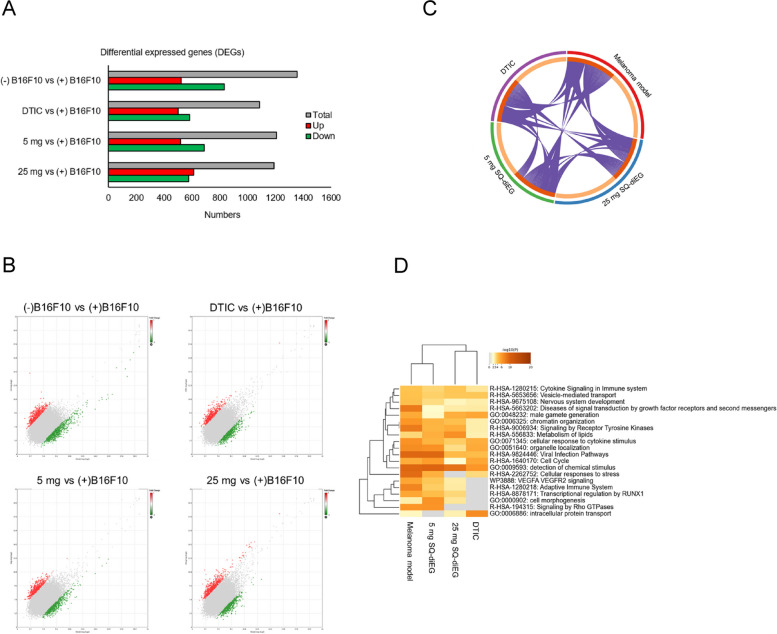
Fig. 4.
Global gene expression profiling of SQ-diEG and DTIC. A Number of DEGs in treatment groups. Red color represents the upregulated DEGs. Green color represents the downregulated DEGs. Grey color represents total DEGs. B Distribution of the DEGs in scatter plot. X-axis and Y-axis represent the average signal intensity (log2). C Circos plot shows how genes from the input gene lists overlap. D Hierarchical cluster plot shows the enriched terms (can be GO/KEGG terms, canonical pathways, hall mark gene sets, etc.) across the treatment groups

