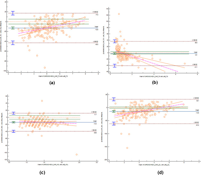
Fig. 2.
Bland-Altman plot comparison of the POCT and laboratory TC, TG, HDL-C and LDL-C measurements. Red dashed horizontal line – line of equality (difference = 0), green horizontal lines on both sides – lines of maximum allowed difference (± X% for Y parameter, e.g. ±5% for total cholesterol), blue horizontal line with green upper and lower limit lines on its extreme left – mean percent differences and its 95%CI, brown dashed horizontal lines with blue upper and lower limit lines on its extreme left – the respective upper and lower limits of agreement and their 95%CI, purple dashed line and orange lines on its sides – the regression line differences that best fits the data and its 95%CI. (a) Total Cholestrol (b) Triglycerides (c) HDL-C (d) LDL-c

