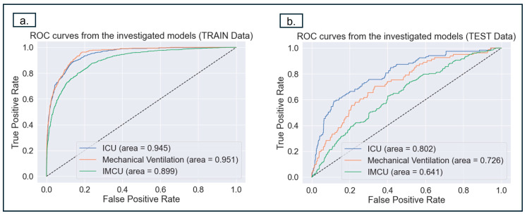
Figure 3.
The figures above depict the ROC analysis to evaluate the models’ performances in predicting MV, ICU, and IMCU for training and test cohorts. (a) This shows the ROC curve for the training dataset (b). This shows ROC curve for the test data, the prediction of ICU achieves the best performance. It should be noted that FP is 1 minus the specificity (TN), which means that the closer FP is to 0, the higher the sensitivity (TN). Therefore, the point should be in the top-left corner of the ROC curve to obtain the optimal values for specificity and sensitivity.

