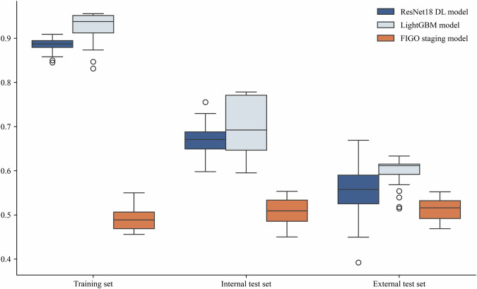
Fig. 4. Comparison of Harrell C-indexes for LightGBM model, ResNet18 DL model and FIGO staging model.
This boxplot compares the performance of three models—ResNet18 DL, LightGBM, and the FIGO staging model—across different datasets: training, internal test, and external test sets. Each boxplot shows the middle 50% of the data, with the top and bottom edges representing the third quartile (Q3) and first quartile (Q1), respectively. The box height (Q3 - Q1) indicates performance variability. The line inside the box shows the median (Q2), reflecting the central tendency. Whiskers extend from the box to 1.5 times the interquartile range, capturing typical values. Points outside this range are outliers, indicating extreme values that significantly deviate from the majority of the data.

