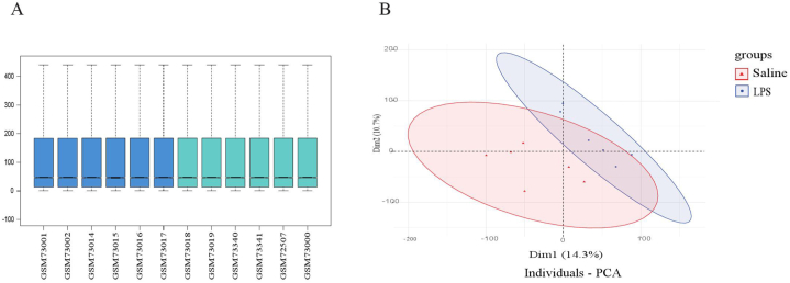
Fig. 2.
Data normalization and the distribution of differentially expressed genes (DEGs). (A) Box plots illustrated data normalization, the data distributions were neat after background adjustment and normalization. (B) Principal component analysis (PCA), each point in the PCA diagram represented a sample, and the inter-distance between samples reflected the difference. After performing batch correction, individuals with similar genetic backgrounds were effectively clustered together, revealing clear stratification between samples from individuals with cognitive impairment and control tissues.

