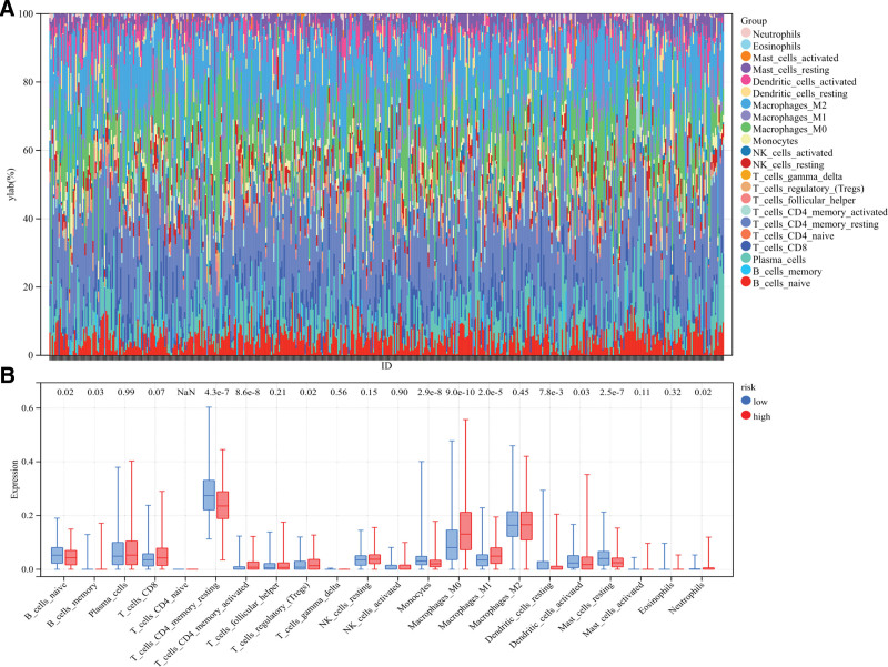
Figure 7.
Difference of immune cell infiltration in different risk subgroups. (A) Histogram of the proportion of 22 immune cells in LUAD tissue. Each cell type is represented by a different color. Each column represents an LUAD sample ID. (B) Box plot shows differences in immune cell infiltration between high and low risk groups.

