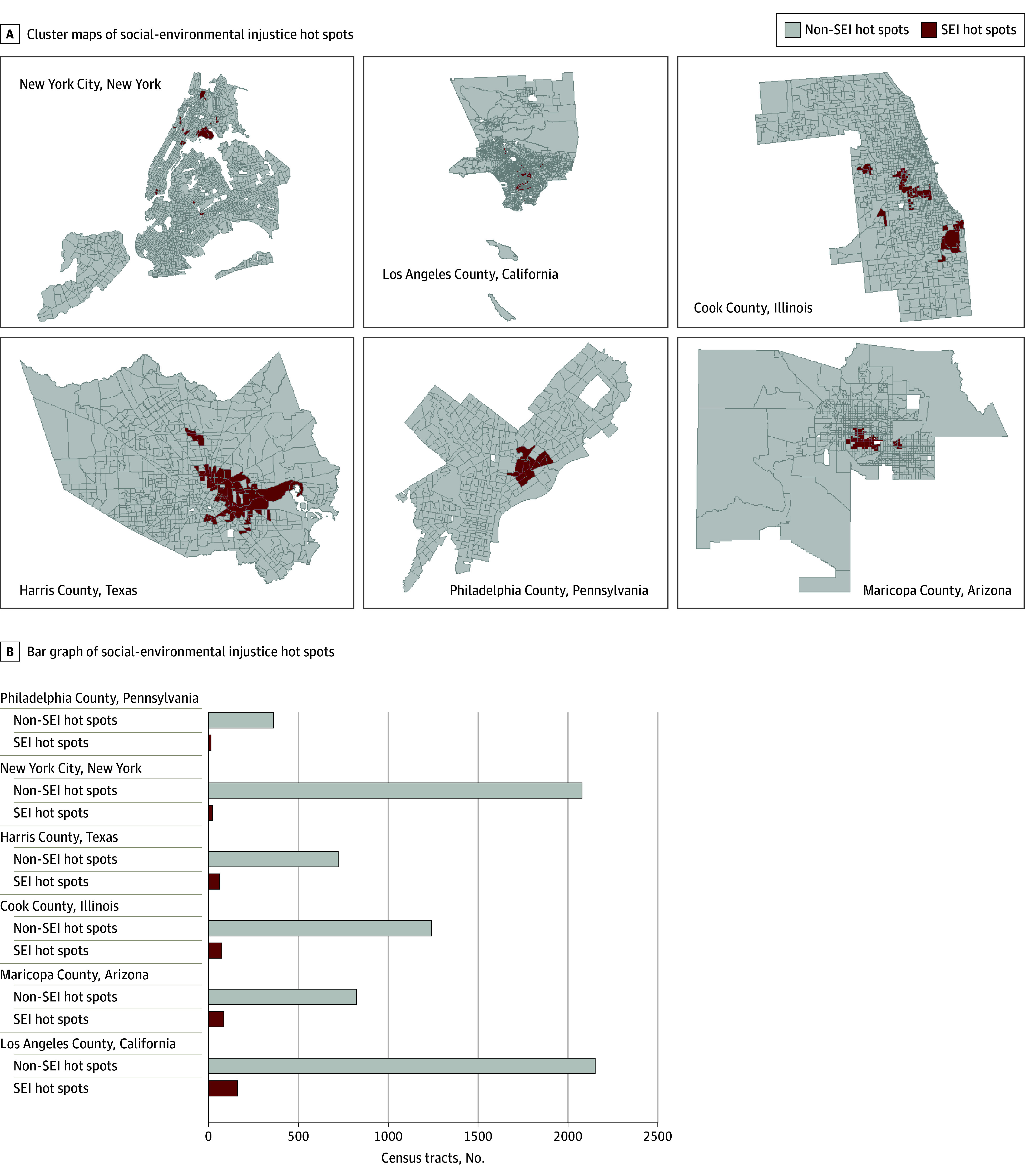
Figure. Geographic Distribution of Social-Environmental Injustice (SEI) Hot Spots.

A, Local Moran I cluster maps of hot spots of SEI in the counties containing the 6 most populous cities in the US. SEI hot spots, determined according to the Environmental Justice Index from the US Centers for Disease Control and Prevention and the Agency for Toxic Substances and Disease Registry, are visualized in dark red. Non–SEI hot spots are visualized in light gray, missing data are visualized in white, and census tract boundaries are visualized in dark gray. B, Bar graph representing number of SEI hot spots (dark red) and non–SEI hot spots (light gray) across the 6 study areas.
