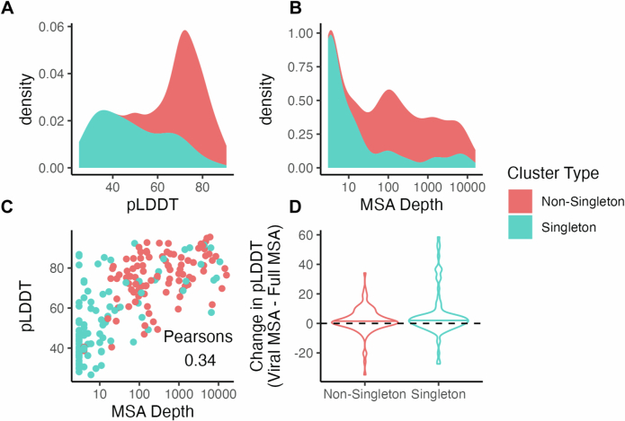
Extended Data Fig. 2. MSA generation against the full Colabfold MMseqs2 Database.
A. The protein representative for the top 100 protein clusters by size and from 100 random singleton clusters were selected, MSAs were generated against the full Colabfold MMSeqs2 database, and structures were predicted from this new MSA. The distribution of pLDDT values for structures from singleton (blue) or non-singleton (orange) clusters are plotted. The X axis indicates the pLDDT, while the Y axis indicates the density (or proportion) of proteins that have the indicated pLDDT value. B. The distribution of MSA depths is plotted for singleton (blue) and non-singleton (orange) clusters. The X axis indicates MSA depth and is log scale, while the Y axis indicates the density (or proportion) of proteins that have the indicated MSA depth. MSA depth is defined as the number of sequences in the MSA. C. For each protein, its pLDDT is plotted on the Y axis while its MSA depth is plotted on the X axis. Each dot is a protein, and the dots are colored according to whether they are from a singleton (blue) or non-singleton (orange) cluster. Pearsons (two-sided) correlation is 0.34 (95 percent confidence interval: 0.2137995, 0.4615760), P value 8.164e-07. D. For each of the 200 proteins studied, the average pLDDT of its structure created with the full Colabfold MSA is subtracted from its average pLDDT when folded with the viral MSA. This change is plotted on the Y axis, where a value above 0 indicates the viral MSA yielded a higher average pLDDT. The X axis indicates whether the proteins are from non-singleton or singleton clusters. The bars in each violin plot indicate the median of the plotted population.

