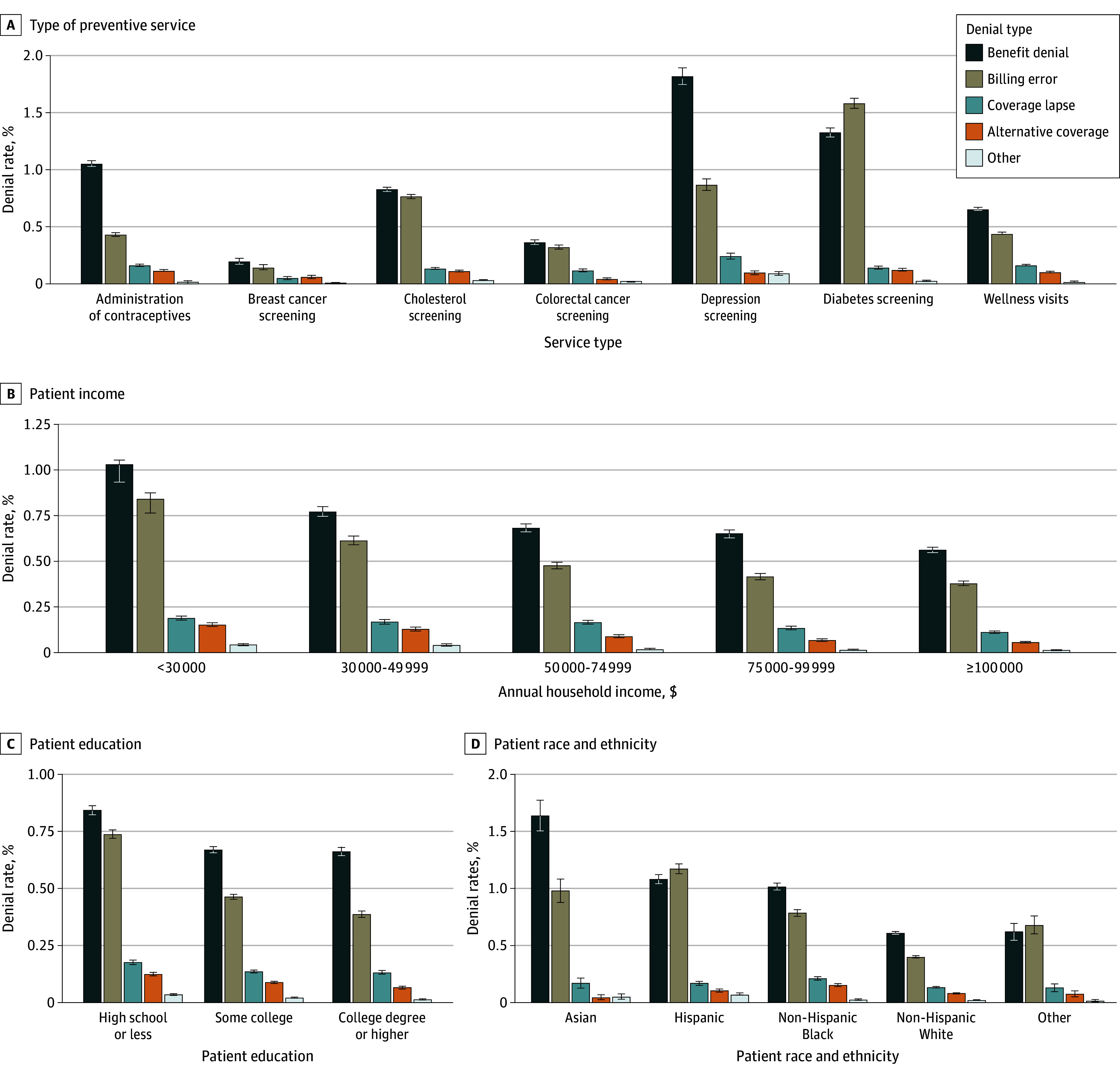
Figure 1. Preventive Claim Denial Rates and Patient Demographics.

Graphs show unadjusted means for preventive benefit denials (measured in percentages; error bars denote 95% CIs) across reported patient demographic information, including type of preventive service (eTable 1 in Supplement 1), patient household income, patient education, and patient race and ethnicity. Patients with missing demographic information are removed from each graph. Other race and ethnicity category includes any patient with identified race or ethnicity not in the primary 4 categories. Denial types are defined in eTable 2 in Supplement 1.
