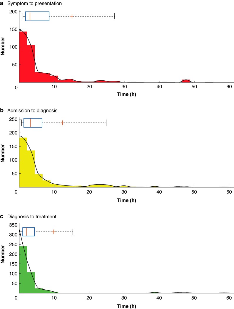
Fig. 1.
Histograms demonstrating the distribution for times from symptom onset to hospital presentation a, admission to imaging diagnosis b and diagnosis to treatment c
Smoothed data is plotted in black. Above individual histograms are box and whisker plots with a red line for median, ‘+’ for the mean, a blue box around the 25 and 75% quartiles and whiskers bounding 9 and 91%.

