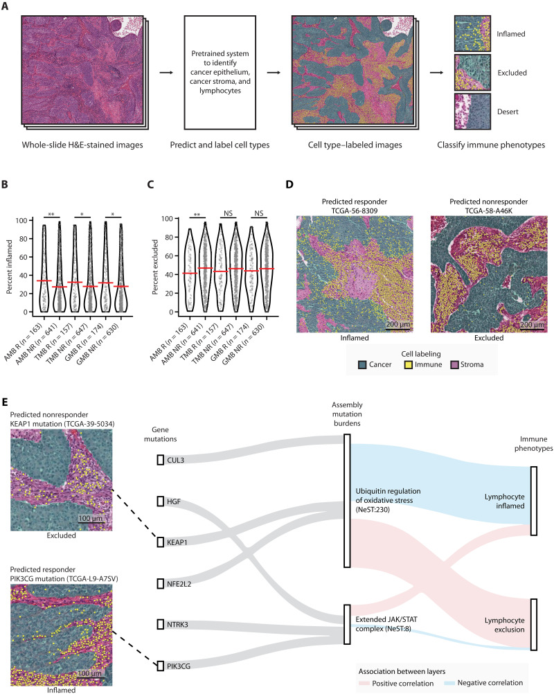
Fig. 5. Immune landscape of patients with predicted high- and low-risk TCGA NSCLC.
(A) Schematic diagram for labeling cell types in patients with TCGA NSCLC using hematoxylin and eosin (H&E)–stained image data. (B and C) Association between predicted ICI responses from AMB-, TMB-, or GMB-based predictions, and immune phenotypes from image data. Percent of (B) inflamed or (C) excluded grids (0.25-mm2 size for each grid) over the total H&E-stained image (see Materials and Methods). Red horizontal bars indicate the mean. Mann-Whitney U test was used to compute statistical significance. *P < 0.05; **P < 0.01; NS, P > 0.05. NS, not significant. (D) Images from representative specimens for patients predicted by the AMB model as ICI responders (left) or nonresponders (right). Images show inflamed (left) or excluded (right) immune phenotypes. Cells colored green, yellow, and purple indicate cancer epithelium, lymphocytes, and cancer stroma, respectively. (E) Sankey diagram showing genetic information flow from mutations in genes (first layer) to AMBs of assemblies (second layer) to immunogenic features (third layer). The top three highly mutated genes (Samstein cohort) in each assembly were selected for display. Feature importance scores [SHapley Additive exPlanations (SHAP) values; see Materials and Methods] are used to highlight associations between layers. Red and blue lines indicate positive and negative associations, respectively.

