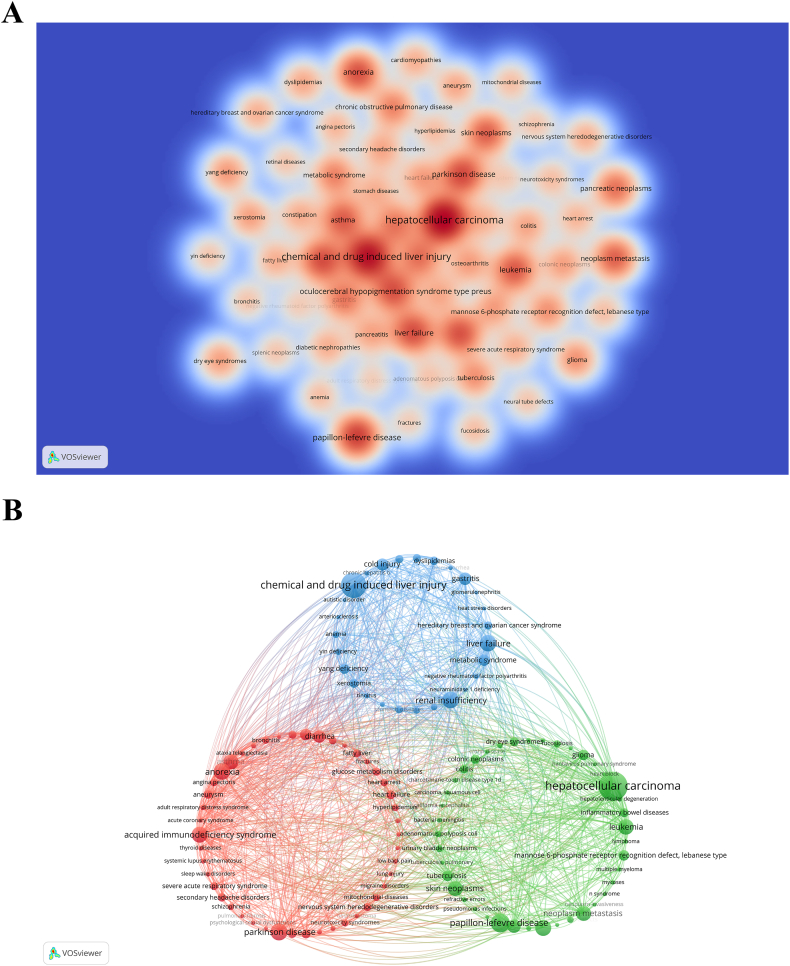
Fig. 9.
(A) Density visualization map of associated diseases. The intensity of color is directly proportional to the frequency of occurrence of the represented disease. (B) Disease clustering analysis chart. Nodes of different colors form distinct clusters, with each color representing a specific disease cluster, indicative of particular biological or medical fields or groups of diseases. (For interpretation of the references to color in this figure legend, the reader is referred to the Web version of this article.)

