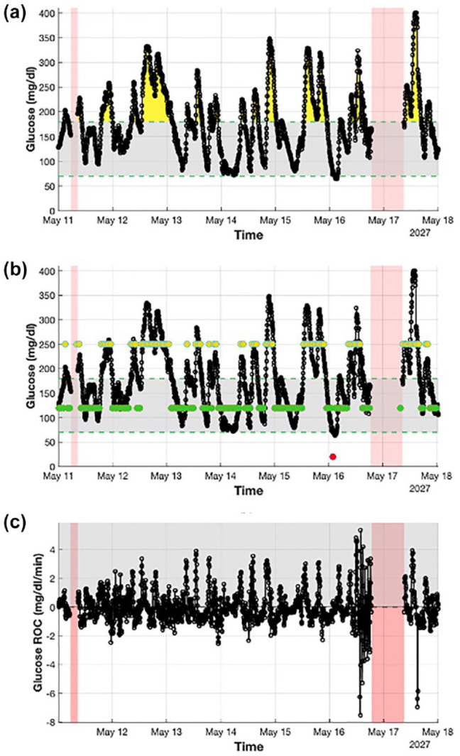
Figure 2.

Detailed visualization of a week of CGM data extracted from a representative subject (Ohio544) obtained using AGATA’s utilities. Panel (a) (plot I) shows with a black solid line the CGM trace and highlights the hyperglycemic events with yellow areas, the hypoglycemic events with red areas, and the missing portion of data with shaded red areas. It also marks the target glycemic range with a shaded gray shaded area delimited by two green dashed lines. Panel (b) (plot II) shows with a black solid line the CGM trace and highlights, with superimposed dots, aggregated glucose values in hyperglycemia (in yellow), hypoglycemia (in red), and target (in green). It also highlights missing portion of data with shaded red areas and marks the target glycemic range with a shaded gray area delimited by two green dashed lines. Panel (c) (plot VII) shows with a black solid line the CGM rate of change. It also highlights positive values with a gray shaded area and the missing portion of data with red shaded areas.
Abbreviations: CGM, continuous glucose monitoring; AGATA, Automated Glucose dATa Analysis.
