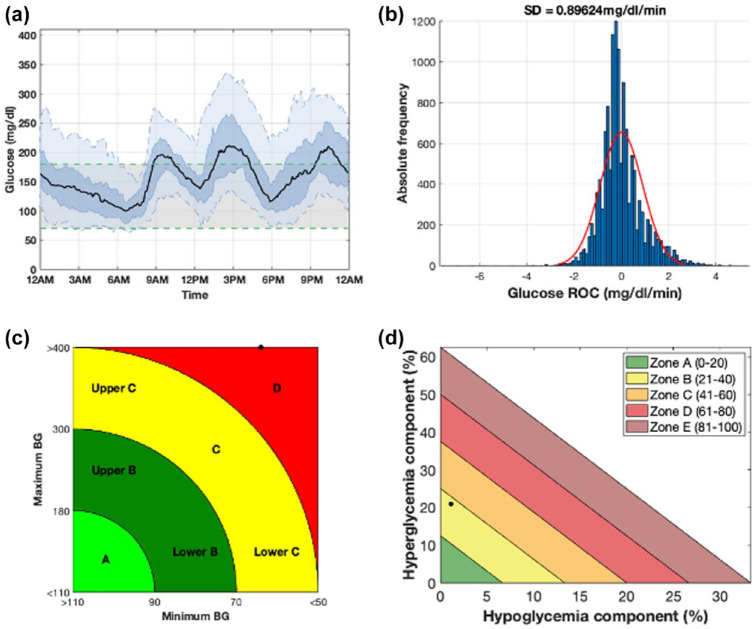
Figure 3.
Summary visualization of a week of CGM data extracted from a retrospective subject (Ohio544) obtained using AGATA’s utilities. Panel (a) (plot III) shows the daily glucose profile distribution resulting from the combination of every single daily profile. The median daily profile is represented with a black bold line, while the shaded dark blue and the shaded light blue areas highlight the 25th to 75th and the 5th to 95th percentiles, respectively. Panel (b) (plot IV) shows the distribution of CGM rate of change as an histogram (in blue) and the respective fitted Gaussian distribution (in red). Panel (c) (plot V) shows the CVGA plot. Panel (d) (plot VI) shows the GRI plot.
Abbreviations: CGM, continuous glucose monitoring; AGATA, Automated Glucose dATa Analysis; CVGA, control variability glucose analysis; GRI, glycemic risk index; BG, blood glucose.

