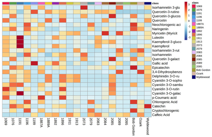
Figure 3.

The heatmap shows the relative abundance of 32 selected putatively identified compounds in the juices collected from various American elderberry genotypes. Each color represents a relative abundance of compounds in the juices. The scale ranges from dark red to dark blue, representing the range of high to no abundance of compounds. Heatmap features the top thirty-two metabolite features as identified by t-test analysis (p < 0.05 and intensity ≥10,000). The distance measure is by Euclidean correlation, and clustering is determined using the Ward algorithm.
