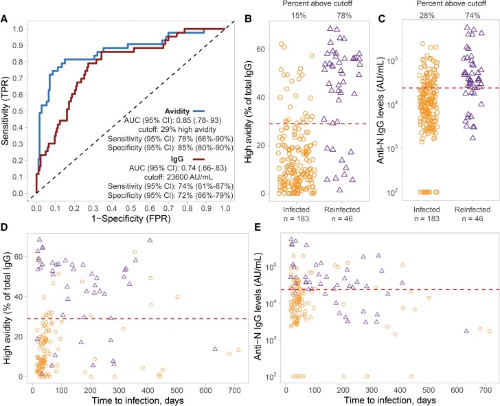
Figure 2.
ROC analysis of the performance of SARS-CoV-2 N antibody avidity method for predicting 1 or 2 SARS-CoV-2 infections. A, ROC curve for prediction of single versus 2 infections using the proportion of high-avidity anti-N IgG antibody fraction (blue line) versus anti-N IgG antibody levels (red line). B, Corresponding percentage of high-avidity N IgG antibody levels over the total N IgG antibody levels in infected (orange circles; n = 183) versus reinfected individuals (purple circles; n = 46). C, Corresponding anti-N IgG antibody levels in the same individuals. D, Proportion of high-avidity anti-N IgG antibody fraction and (E) anti-N IgG antibody levels between the same 2 groups over time to the most recent self-reported infection (days). The dashed lines in B to E represent the optimized cut-offs for detection of infection versus re-infections. Abbreviations: AUC, area under the curve; CI, confidence interval; FPR, false positive rate; IgG, immunoglobulin G; N, nucleocapsid; ROC, receiver operating characteristic; SARS-CoV-2, severe acute respiratory syndrome coronavirus 2; TPR, true positive rate.

