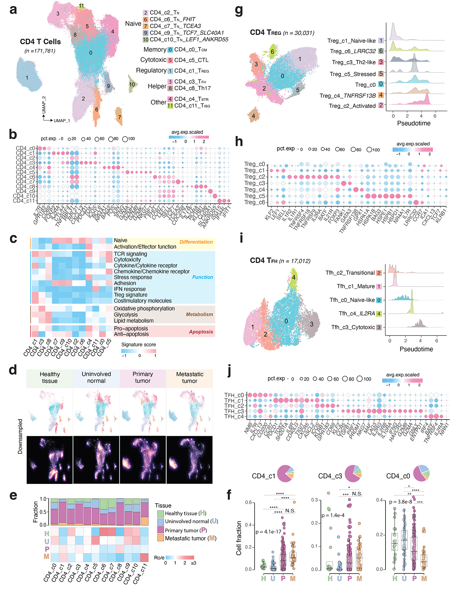
Figure 3. The landscape of CD4 T cells.

a) UMAP view of 12 CD4 T cell clusters. b) Bubble plot showing marker gene expression across defined clusters. More marker genes are shown in Extended Data Fig. 3a and a list of the top 50 most significant DEGs are provided in Supplementary Table 5. c) Heatmap displaying expression of 16 curated gene signatures (as listed in Supplementary Table 6) across CD4 T cell clusters. d) UMAP view of CD4 T cell states (top) and cell density (bottom) demonstrating CD4 T cell distribution across 4 tissue groups. Downsampling was applied, and 10,703 cells were included for each group. High relative cell density is shown as bright magma. e) Distribution of CD4 T cell states across different tissues. (Top) bar plot showing the relative proportion of cells from 4 tissue types and (bottom) heatmap showing tissue prevalence estimated by Ro/e. f) Box plots comparing cellular fractions of three CD4 T cell subsets across tissue types. Each dot represents a sample. Pie charts displaying tissue composition. The one-sided Games-Howell test was applied to calculate the p values between those 4 tissue types (sample number n = 20, 53, 158, 39), followed by FDR correction. FDR adjusted p-value: * ≤0.05; **≤0.01; ***≤0.001, ****≤0.0001. For CD4_c1, pHvsP = 4.08e-13, pHvsM = 4.03e-6, pUvsP = 4.08e-13, pUvsM = 4.03e-16. For CD4_c3, pUvsP = 4.05e-4, pUvsM = 0.021. For CD4_c0, pHvsM = 0.002, pUvsP = 0.023, pUvsM = 9e-8, pPvsM = 8.06e-5. Boxes, median ± interquartile range; whiskers, 1.5× interquartile range. g) UMAP plot of seven CD4 Treg subclusters (left) and (right) ridge plots displaying the distribution of inferred pseudotime across Treg subclusters. h) Marker gene expression across Treg subclusters. The complete list of significant DEGs is provided in Supplementary Table 7. i) UMAP plot of five CD4 Tfh subclusters (left) and (right) ridge plots illustrating the distribution of inferred pseudotime across Tfh subclusters. j) Marker gene expression across Tfh subclusters. A list of significant DEGs is provided in Supplementary Table 8.
