
Extended Data Fig. 2. Characterization of CD8 T cell clusters.
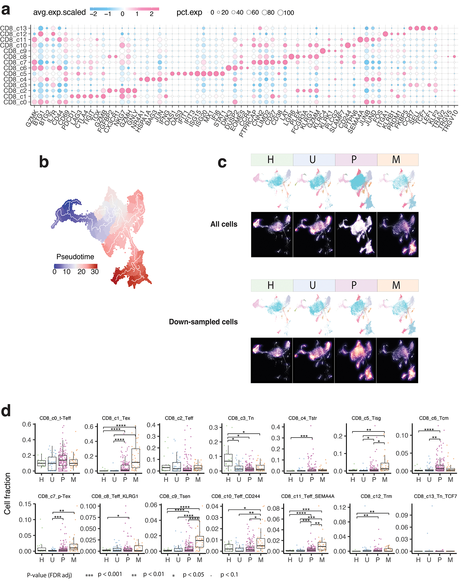
a) Bubble plot showing the average expression levels and cellular fractions of selected marker genes in 14 defined CD8 T cell clusters. The complete list of the top 50 most significant differentially expressed genes (DEGs) is provided in Supplementary Table 3. b) Monocle 3 trajectory analysis of CD8 T cell differentiation demonstrating multiple possible routes. c) The UMAP and density plots before and after downsampling analysis. UMAP (top) and density plots (bottom) of CD8 T cells demonstrating T cell distribution across four main tissue groups. High relative cell density is shown as bright magma. For CD8 T cells, the downsampled cell number is 11,592 cells for each tissue group. d) Box plot showing cell fractions of CD8 T cell subsets across four tissue groups. Each dot represents a sample. H, normal tissues from healthy donors; U, tumor-adjacent uninvolved tissues; P, primary tumor tissues; M, metastatic tumor tissues. The one-sided Games-Howell test was applied to calculate the p values between those four tissue groups (n = 20, 51, 156, 39), followed by FDR (false discovery rate) correction. FDR-adjusted p value: *≤0.05; **≤0.01; ***≤0.001; ****≤0.0001. Boxes, median ± the interquartile range; whiskers, 1.5× interquartile range.