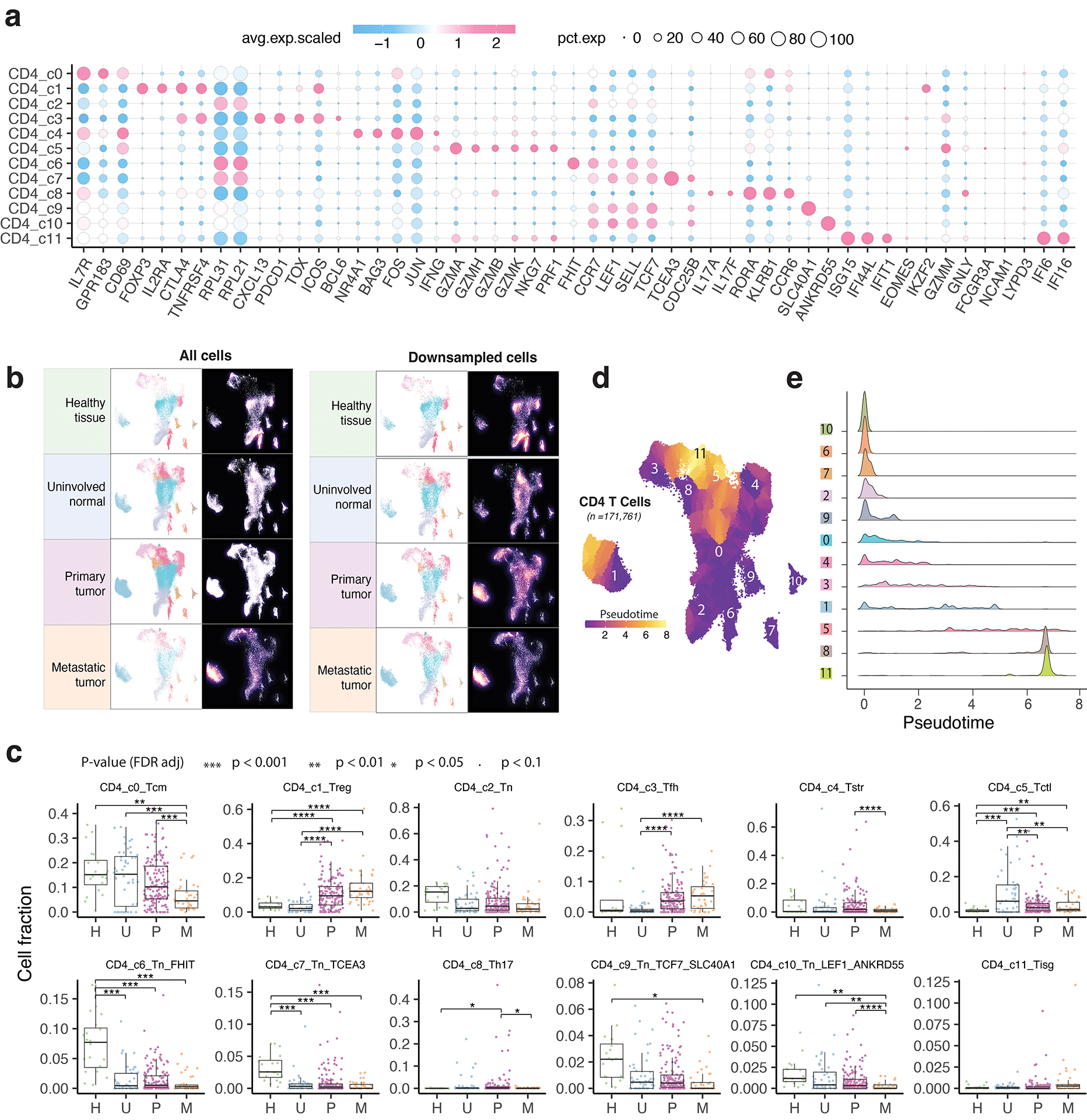
Extended Data Fig. 3. Characterization of CD4 T cell clusters.

a) Bubble plot showing marker gene expression across 12 defined CD4 T cell clusters. The complete list of the top 50 most significant DEGs is provided in the Supplementary Table 5. b) The UMAP and density plots before and after downsampling analysis. UMAP (left) and density plots (right) of CD4 T cells demonstrating T cell distribution across four main tissue groups. High relative cell density is shown as bright magma. For CD4 T cells, the downsampled cell number is 10,703 cells for each tissue group. c) Box plot showing cell fractions of 12 CD4 T cell subsets across four tissue groups. Each dot represents a sample. H, normal tissues from healthy donors; U, tumor-adjacent uninvolved tissues; P, primary tumor tissues; and M, metastatic tumor tissues. The one-sided Games-Howell test was applied to calculate the p values between those four tissue groups (n = 20, 53, 158, 39), followed by FDR (false discovery rate) correction. FDR-adjusted p value: *≤0.05; **≤0.01; ***≤0.001; ****≤0.0001. Boxes, median ± the interquartile range; whiskers, 1.5× interquartile range. d) Monocle 3 trajectory analysis of CD4 T cells. Cells are color coded for their corresponding pseudotime. e) Ridge plots show the distribution of inferred pseudotime across CD4 T cell clusters.
