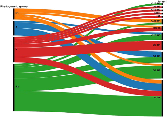
Figure 3.
Correlation between Serotype, Phylogenetic Group, and Specimen Source. The figure illustrates the distribution of serotypes across different phylogenetic groups (A, B1, B2, D) and their association with specimen sources (blood, urine, pus, stool). The Sankey Diagram was visualized by RAWGraphs 2.0.1 (https://www.rawgraphs.io), an open-source data visualization framework. Each serotype is represented with its corresponding phylogenetic group, and the distinct specimen origins are indicated by color-coded symbols. This correlation analysis provides insights into the stereotypic diversity and specimen-specific associations within the bacterial population.

