. 2024 Sep 25;13:RP91849. doi: 10.7554/eLife.91849

Figure 1. Annual influenza A(H3N2) epidemics in the United States, 1997 – 2019.

(A) Weekly incidence of influenza A(H1N1) (blue), A(H3N2) (red), and B (green) averaged across 10 HHS regions (Region 1: Boston; Region 2: New York City; Region 3: Washington, DC; Region 4: Atlanta; Region 5: Chicago; Region 6: Dallas, Region 7: Kansas City; Region 8: Denver; Region 9: San Francisco; Region 10: Seattle). Incidences are the proportion of influenza-like illness (ILI) visits among all outpatient visits, multiplied by the proportion of respiratory samples testing positive for each influenza type/subtype. Time series are 95% confidence intervals of regional incidence estimates. Vertical dashed lines indicate January 1 of each year. (B) Intensity of weekly influenza A(H3N2) incidence in 10 HHS regions. White tiles indicate weeks when influenza-like-illness data or virological data were not reported. Data for Region 10 are not available in seasons prior to 2009.

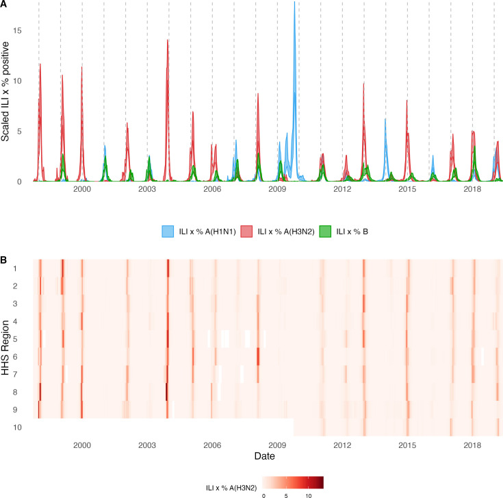
Figure 1.

Figure 1—figure supplement 1. Annual influenza A(H1N1) and influenza B epidemics in the United States, 1997 - 2019.

Figure 1—figure supplement 1.

Intensity of weekly (A) influenza A(H1N1) and (B) influenza B incidence in 10 HHS regions. Incidences are the proportion of influenza-like illness (ILI) visits among all outpatient visits, multiplied by the proportion of respiratory samples testing positive for each influenza type/subtype. Seasonal and pandemic A(H1N1) are combined as influenza A(H1N1), and the Victoria and Yamagata lineages of influenza B are combined as influenza B. White tiles indicate weeks when either influenza-like-illness cases or virological data were not reported. Data for Region 10 are not available in seasons prior to 2009.
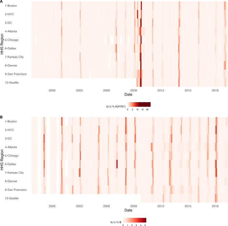
Figure 1—figure supplement 2. Influenza test volume systematically increases in all HHS regions after the 2009 A(H1N1) pandemic.

Figure 1—figure supplement 2.

Each point represents the total number of influenza tests in each HHS region in each season, as reported by the U.S. CDC WHO Collaborating Center for Surveillance, Epidemiology and Control of Influenza. In each boxplot, the whiskers extend to the first and third quartiles of the distribution, and the centre bar represents the median number of specimens. Data for Region 10 are not available in seasons prior to 2009.
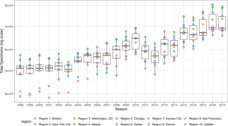
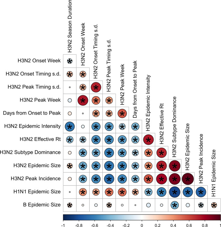
Figure 1—figure supplement 3. Pairwise correlations between seasonal influenza A(H3N2), A(H1N1), and B epidemic metrics.

Figure 1—figure supplement 3.

Spearman’s rank correlations among indicators of A(H3N2) epidemic timing, including onset week, peak week, regional variation (s.d.) in onset and peak timing, the number of days from epidemic onset to peak incidence, and seasonal duration, indicators of A(H3N2) epidemic magnitude, including epidemic intensity (i.e. the ‘sharpness’ of the epidemic curve), transmissibility (maximum effective reproduction number, Rt), subtype dominance, epidemic size, and peak incidence. Correlations between the circulation of other influenza types/subtypes and A(H3N2) epidemic burden and timing are also included. The color of each circle indicates the strength and direction of the association, from dark red (strong positive correlation) to dark blue (strong negative correlation). Stars within circles indicate statistical significance (adjusted p<0.05). The Benjamini and Hochberg method was used to adjust p-values for multiple testing.