. 2024 Sep 25;13:RP91849. doi: 10.7554/eLife.91849

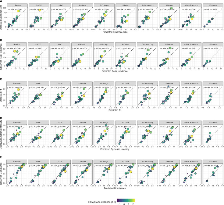
Figure 9. Observed versus predicted values of seasonal region-specific influenza A(H3N2) epidemic metrics from conditional inference random forest models.

(A) Epidemic size, (B) peak incidence, (C) transmissibility (maximum effective reproduction number, Rt), (D) epidemic intensity, and (E) subtype dominance. Results are facetted by HHS region and epidemic metric. Point color and size corresponds to the mean H3 epitope distance between viruses circulating in the current season t and viruses circulating two prior seasons ago (t – 2). Large, yellow points indicate seasons with high antigenic novelty, and small blue points indicate seasons with low antigenic novelty. In each facet, the Spearman’s rank correlation coefficient and associated p-value are in the top left section, and the black dashed line shows y=x.

Figure 9.

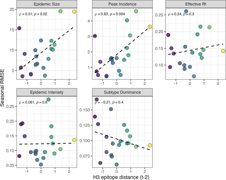
Figure 9—figure supplement 1. Relationships between the predictive accuracy of random forest models and seasonal H3 epitope distance.

Figure 9—figure supplement 1.

Root mean squared errors between observed and model-predicted values were averaged across regions for each season, and results are facetted according to epidemic metric. Point color corresponds to the mean H3 epitope distance between viruses circulating in the current season t and viruses circulating two prior seasons ago (t – 2), with bright yellow points indicating seasons with greater antigenic novelty. In each facet, the Spearman’s rank correlation coefficient and associated p-value are in the top left section, and the black dashed line represents the linear regression fit.
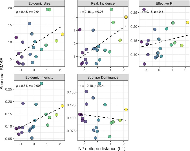
Figure 9—figure supplement 2. Relationships between the predictive accuracy of random forest models and seasonal N2 epitope distance.

Figure 9—figure supplement 2.

Root mean squared errors between observed and model-predicted values were averaged across regions for each season, and results are facetted according to epidemic metric. Point color corresponds to the mean N2 epitope distance between viruses circulating in the current season t and viruses circulating in the prior season (t – 1), with bright yellow points indicating seasons with greater antigenic novelty. In each facet, the Spearman’s rank correlation coefficient and associated p-value are in the top left section, and the black dashed line represents the linear regression fit.