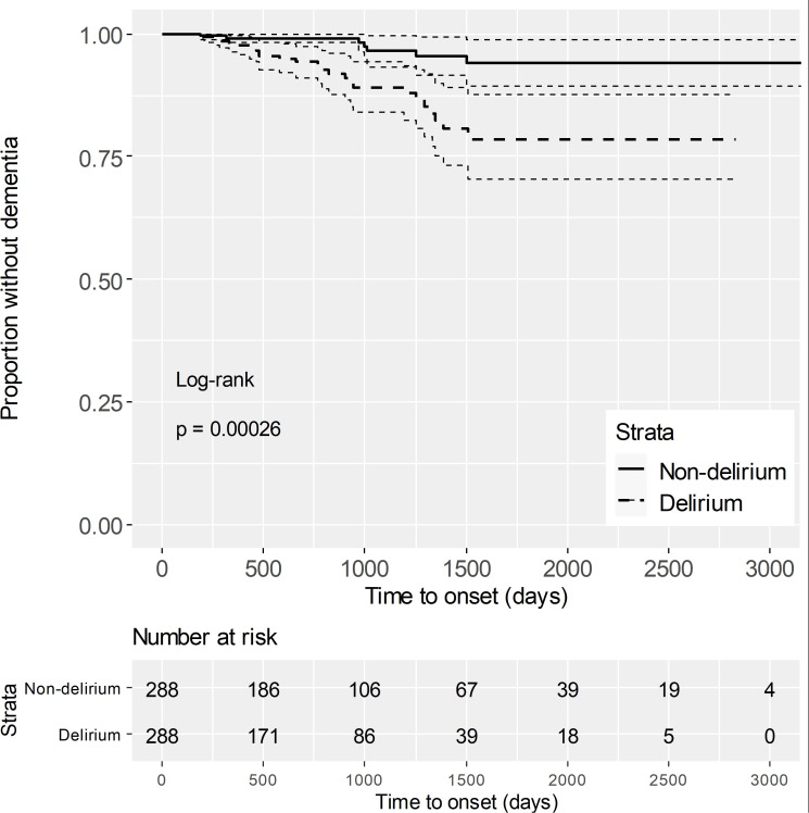
Figure 2.
Kaplan-Meier curves after propensity score matching The solid line represents the survival rate (proportion without dementia) for the non-delirium group. The dashed line represents the survival rate for the delirium group. Dotted lines indicate the 95% confidence intervals, reflecting the uncertainty in survival estimates. The "Number at risk" below the plot shows the number of individuals at risk for dementia at each time point. The log-rank test yielded a p-value of 0.00026, indicating a significant difference in dementia risk between the two groups.

