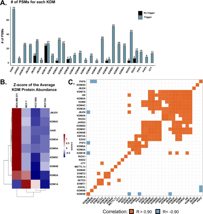
Figure 2: Quantification of lysine demethylases in breast cancer cell lines.
A. Bar graph depicting the number of PSMs observed with (blue) and without (black) the KDM trigger channel for the indicated KDM. B. Heatmap of the z-score of the differentially abundant average protein abundance. Rows are the indicated KDM, while columns are the indicated cell line. Columns and rows are clustered via hierarchical clustering (Euclidean distance). C. Matrix of the quantified KDMs and KMTs in the trigger channel experiment depicting significant positive (orange) and negative (blue) Pearson correlations of the average protein abundance.

